How to build a landing page in Sketch
Learn how to design landing pages that dazzle and convert
As we all know, the Internet is a saturated place. According to Siteefy, there are currently 1.14 billion websites on the World Wide Web. That’s a lot of sites to compete with. But don‘t worry, all you need is a good bait — we mean, landing page — and you’ll be reeling in those site visitors in no time.
Don’t know where to start? We’ve got you covered! In this post, we’ll be showing you how to design your own landing page, make it stand out from the crowd and the different uses you can give it — all in Sketch. Once you’re done reading, you won’t be needing to phone Houston about any problems.
Let’s get ready for launch 🚀
What is a landing page?
So when we said “bait,” we weren’t kidding. A landing page is a single web page marketers use for specific campaigns. It’s where you want your visitor to “land” after they follow a CTA link in your email, ad, or social media post. Once the visitor lands on your page, it’s up to your design and content to get them to convert. That’s why we also call landing pages “destination” or “lead capture” pages.
But what’s the difference between a website and a landing page?
The key difference between a regular website and a landing page is that a website or “homepage” tends to house all sorts of information. The user journey can be anything from filling out a form on your contact page to purchasing a product. Meanwhile, a landing page typically focuses on completing a specific action, such as getting the visitor to download an ebook or sign up for an event. Overall, landing pages are single-purpose and have leaner designs — with fewer tabs or CTAs.
Landing page anatomy
Now, let’s look at the core elements that make up a landing page. These are the elements you want to get right if you want to set up your landing page for success.
- Hero. A banner that divides your navigation from the rest of the page’s content. It’s the first thing your visitors will see, making it the best place to grab their attention and point them in the right direction.
- Value proposition. A statement that informs of your product offering and what sets you apart from competitors. You can use the hero banner to reference your value proposition.
- Call to action (CTA). A short message that inspires your audience to take action — whether it’s to click on your ad, download your ebook, or add an item to their cart. You can add CTAs to your designs in the shape of links and buttons.
- Social proof. This helps visitors trust your services even if they’ve never met you or heard about you. You’ll commonly see this as a section with reviews or testimonials from current customers.
How to design a landing page in Sketch
It‘s time to start designing — no worries, we‘ll go step by step. For this tutorial, we’ll be creating a landing page for a banking app, but you can follow the same steps to create a design for any topic using your own logos and brand identity.
Add an Artboard Template and set up a layout grid
As usual, it all starts with an Artboard. Press A to trigger the Artboard tool and select Web > Medium from the dropdown menu in the Inspector. Be mindful of expanding the height of the Artboard as we add sections, but it will work well for now!
Next, let’s add a column grid layout to help us break up the copy and visuals. To define it, use the shortcut ⌃⌘L or head to View > Canvas > Layout Settings.
Once you have the Layout Settings modal open, you’ll want to input the following values:
- Total width: 1200px
- Offset: 120px
- Number of columns: 12
- Gutter width: 24px
- Column width: 78px
Press Confirm, and you should end up with something like this:
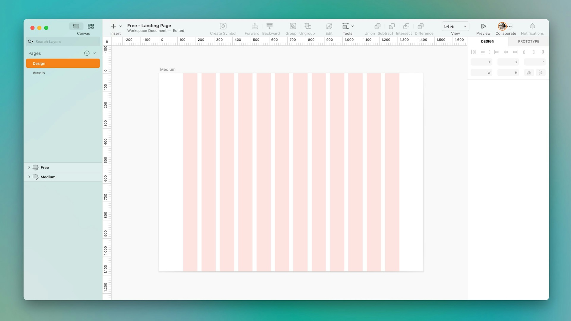
This setup is great for creating responsive web designs — and it’s what we’re using for Sketch’s homepage!
Create a navbar
Press R and click and drag to create a 1440x80 px rectangle. You can always adjust these values using the controls in the Inspector. For our design, we’ll give the nav bar a white background (#FFFFFF). Then, add a shadow with the following values to make the navbar stand out from the rest of the landing page:
- Color: #000000
- Alpha: 5
- X: 0
- Y: 10
- Blur: 20
Want to work with more handy shortcuts? We’ve got a list!
From here, you can insert logos, buttons, and menu items as you see fit. For our example, we’re adding in a few Symbols from our brand Library including a logo and a sign-up button.
Since this landing page has a different theme from the app and the bank’s homepage, we’re using overrides to change the button’s color.
Design the hero section
As we mentioned, the hero banner is the perfect place to add your value proposition and call to action. For this section, let’s create a 1440x660 px rectangle and place it under the nav bar.
Once the base is ready, press T to add in a few text layers for your title (83px, Semibold) and subtitle (20px, Regular).
You’ll want the copy here to sell your value proposition, so think about what you’re offering your visitors and how to communicate it clearly and enticingly.
And of course — our favorite part — let’s chat design. Use backgrounds and visual elements to help elevate your message. In this example, we’ve added a subtle gradient background to guide the eye to the banner and coupled it with a few credit card illustrations to help immediately communicate that this is a bank-related app.
Loving these credit card illustrations? Learn to create your own with another one of our tutorials.
Incorporate the CTA
A best practice when working with CTAs is keeping it under five words, so it’s time to put on your UX copy thinking hat. In our example, we’ve gone with “Get started for free” — a phrase we commonly use in various Sketch touch points.
To make your own CTA button, create a 195x52 px rectangle and set the corner style to Rounded and the radius to 15. To make it pop — as we did with the nav bar — you can add a shadow with the following values:
- Color: #000000
- Alpha: 10
- X: 0
- Y: 20
- Blur: 40
Once you’re happy with your button, add in a text layer (15px, Semibold) — though you might need to adjust depending on the font you’re using.
Your CTA button should reflect the action you want your landing page visitor to take.
Add some facts
A good way to earn the trust of your landing page visitors is by offering up some facts about your company or product. In this example, we’ll do that by highlighting some key metrics in a dedicated section.
Let’s start by creating a 1440x240 px rectangle, removing the border, and placing it right under the hero section. In our example, we’re giving the rectangle a grayish color (#F3F4F5).
To build your metrics, create two text layers for your figure (80 px, Semibold) and description (15 px, Regular). Once you have them, type in some copy and place the layers side by side. Then, select them by holding ⇧ and either group them using ⌘G or turn them into a Symbol by using ⌘Y.
You’ll now want to duplicate this group or Symbol three times using ⌘D and spread the copies along your rectangle. To make sure your metrics are equally spaced out, select them all and click on the Tidy button in the Inspector. You can also adjust the distance using the Smart Distribute handles on the Canvas.
Between Tidy and Smart Distribute, uneven spacing ain’t got nothing on you.
Create a home for social proof
So we’ve told the landing page visitor why our product or service works. But they don’t have to take our word for it! Let’s design a section for social proofing to support the claims we just made in the fast facts section. Here we’ll add some testimonials and include avatar images.
Create a 1440x370 px rectangle, remove the border, and place it right beneath the fast facts section. We went with a white (#FFFFFF) background color for this one. Next, add a text layer to give the section a title (35px, Semibold) — such as “What our clients say”.
Let’s use a 110x110 px rectangle to serve as a container for our avatar images. Remove the border and round the corners to 18 to give it a smooth look. Then, Click on the fill color in the Inspector to replace the fill and select the fifth option at the top. Here, you can drag and drop an image from your desktop or auto-populate your avatar by clicking on the Data icon and choosing Sketch Data > Faces.
Now, create a text layer (17px, Bold) for the reviewer’s name and another one (17px, Italic) for the review. Make sure to keep the copy brief to give your design enough breathing room. Once you’re ready, group the layers, duplicate and organize them like we did in the previous section.
Want a quicker way to add images as fills? Auto-populate one by choosing Sketch Data > Faces!
Add a footer
A footer is like the bottom bun in the hamburger of web design. It’s a great place to give visitors additional links to resources, such as product information, privacy policies, and social media pages. For this footer design, we’re going with a 1440x265 rectangle and are giving it a black background (#000000) to help keep the focus on the rest of the landing page.
Once you have your base, you can start populating it as you see fit. If you have a lot to share, you can use the same column approach we’ve been using. If you do, we recommend adding some bolded titles to help illustrate what each column is about. For icons such as social media logos, 24x24 px is a good size to stick with if you’ve been using the font sizes we’ve recommended.

Want to recreate this landing page to a T? We have a whole walkthrough on it.
And there you have it! With this guide, you’ll easily be able to create a landing page of your own and personalize the design along the way.


